

Great design really matters, and typography is a big part of how people experience a website. As we head into 2025, keeping visitors on your site is more important than ever. People often decide in just a few seconds whether they want to stay or leave based on how good a site looks. One simple and effective way to make your website more appealing is by choosing the right google fonts.
Google Fonts offers a huge collection of free fonts that can enhance your site’s design and encourage users to interact with it. In this guide from Owrbit, we’ll share the top five Google Fonts that we think will be popular in web design in 2025. Each font is chosen for its style and how well it conveys your brand message while also being easy to read. Whether you’re a pro web designer or a business owner looking to give your website a fresh look, knowing about these fonts can help you engage your audience more effectively. Let’s explore these amazing typefaces that can make a lasting impression!

Introduction to Google Fonts :
Google Fonts is a free resource that provides a large collection of fonts you can use for websites and print projects. Since its launch in 2010, it has become a popular choice for designers, developers, and anyone looking to improve the look of their text without paying for fonts.
The library includes thousands of font options, from classic styles like serif and sans-serif to more unique display and handwriting fonts. All the fonts are designed to work well on the web, so they load quickly and look great on different devices, whether it’s a smartphone, tablet, or computer.
Using Google Fonts is easy. You can browse through the library by different categories or see which fonts are currently popular. You can even type in your own text to see how it looks with various fonts before making a choice. Once you find a font you like, Google gives you simple code to add it to your website.
In addition to having so many choices, Google Fonts supports multiple languages and lets you customize your selection by adjusting weights, styles, and sizes to fit your design perfectly.
Overall, Google Fonts is a fantastic tool for anyone who wants to make their design stand out with beautiful text, making it simple to create attractive and user-friendly websites.

Importance of Google Fonts :
Google Fonts plays a crucial role in modern web design and development for several reasons:
- Free and Open-Source: One of the biggest advantages of Google Fonts is that it’s completely free. Anyone can use the fonts without worrying about licensing fees, making it accessible for individuals, small businesses, and large organizations alike.
- Wide Variety: The library offers thousands of font families, allowing designers to find the perfect typeface for their projects. This extensive selection ensures that there’s something to match every style and brand identity, from classic to contemporary.
- Web Optimization: Google Fonts are designed specifically for web use. They load quickly and are optimized for various devices and screen sizes, ensuring that your website looks good on everything from smartphones to large monitors. This enhances user experience and keeps visitors engaged.
- Easy Integration: Adding Google Fonts to your website is straightforward. With just a few lines of code, you can embed any font into your site, allowing for quick and hassle-free customization.
- Customization Options: Google Fonts offers flexibility in choosing different weights, styles, and sizes for each font. This level of customization allows designers to create unique and visually appealing text that aligns with their overall design goals.
- Consistency Across Platforms: By using Google Fonts, you can maintain consistent typography across different platforms and browsers. This ensures that your website looks the same for all users, no matter what device or browser they are using.
- Support for Multiple Languages: Many fonts in the Google Fonts library support a variety of languages and character sets, making it a great choice for international websites or projects that need to cater to diverse audiences.
- Community Contributions: Google Fonts encourages contributions from the design community, which means the library is constantly growing and evolving. This results in fresh, new fonts that reflect current design trends and styles.
How Fonts Influence User Engagement :
- First Impressions Matter: The font you choose sets the tone for your website right from the first glance. A clean, modern font can convey professionalism and trust, while a playful font can create a fun and inviting atmosphere. This initial impression can affect whether users choose to stay on your site or leave.
- Readability and Comprehension: Fonts that are easy to read encourage users to consume your content more effectively. If a font is too decorative or complicated, it can strain the eyes and lead to frustration, causing users to abandon the page. Clear and legible fonts enhance comprehension and keep readers engaged.
- Brand Identity: Fonts contribute to your brand’s identity and personality. A well-chosen typeface can reinforce your brand message and values, helping users connect emotionally with your brand. Consistent use of fonts across your website helps build brand recognition and trust.
- Hierarchy and Structure: Good typography establishes a clear hierarchy, guiding users through your content. By using different font sizes, weights, and styles, you can highlight important information and create visual breaks. This organization helps users navigate your site more easily, improving their overall experience.
- Emotional Impact: Fonts can evoke emotions and influence how users feel about your content. For example, serif fonts often convey tradition and reliability, while sans-serif fonts can feel modern and approachable. The right font can enhance the emotional connection users have with your content.
- Cultural Relevance: Different fonts can resonate with specific audiences or cultures. By selecting fonts that align with your target demographic, you can create a sense of familiarity and trust. This cultural relevance can make users more likely to engage with your content.
- Visual Appeal: Attractive typography adds to the overall aesthetic of your website. A well-designed font can make your site more visually appealing, encouraging users to explore more pages and spend more time on your site. Good design keeps users engaged and interested.
- Mobile Compatibility: With the growing use of mobile devices, choosing fonts that look good on smaller screens is essential. Responsive typography ensures that your text is readable and visually appealing on any device, which is crucial for maintaining user engagement.
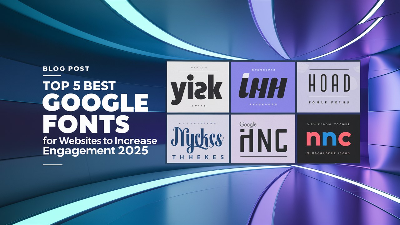
Top 5 Google Fonts for Websites to Increase Engagement :
Choosing the right font can significantly impact user engagement on your website. Here are five Google Fonts that stand out for their aesthetics, readability, and ability to enhance user experience:

#1 : Roboto
Roboto is a modern sans-serif typeface designed by Christian Robertson and released by Google in 2011. Originally created for the Android operating system, it has gained popularity across various digital platforms and print applications. Roboto features geometric shapes that contribute to its clean, polished appearance, and is known for its excellent readability, making it suitable for both body text and headings. The font is available in multiple weights and styles, enhancing its versatility.

Usage :
- Web Design: Commonly used for websites, Roboto works well for both headings and body text, providing a seamless reading experience.
- Mobile Applications: As the default font for Android, it is widely used in mobile app interfaces to enhance usability and readability.
- Print Media: Suitable for brochures, flyers, and business cards, Roboto’s professional look makes it a popular choice for various print materials.
#2 : Open Sans
Open Sans is a widely-used sans-serif typeface designed by Steve Matteson and released through Google Fonts. Known for its clean and modern look, Open Sans offers excellent legibility, making it suitable for various design contexts. It features a neutral yet friendly appearance, making it versatile for both digital and print applications. The font includes a wide range of weights and styles, allowing designers to create visual hierarchy and emphasis in their projects.

Usage :
- Web Design: Perfect for websites, blogs, and e-commerce platforms, suitable for both body text and headings.
- User Interfaces: Commonly used in app and software interfaces for buttons, menus, and interactive elements due to its clarity.
- Marketing Materials: Effective in print and digital marketing materials like flyers, brochures, and social media graphics.
- Presentations: Great for presentation slides, ensuring messages are clear and visually appealing at different sizes.
#3 : Lora
Lora is a modern serif font that combines traditional style with contemporary flair. Its elegant curves and strong serifs make it both visually appealing and highly readable. Lora is perfect for projects where you want to convey sophistication, professionalism, or a classic feel, while still maintaining a modern edge.

Usage :
- Long-form articles and blogs: Its readability makes it a great choice for text-heavy content.
- Headings and subheadings: Lora adds a sophisticated, formal feel to headings while remaining easy to read.
- Creative portfolios: The font’s stylish yet readable design can enhance visual storytelling.
- Elegant websites: Whether it’s a boutique business or a personal blog, Lora elevates the design with a classic, professional vibe.
#4 : Montserrat
Montserrat is a modern, sans-serif font inspired by the signage and typography found in the Montserrat neighborhood of Buenos Aires. It has a bold, geometric style that gives it a clean, contemporary look, making it ideal for creating a strong visual impact. Montserrat has a large x-height, wide letter spacing, and sharp edges, which help improve readability while maintaining a sleek design.

When to Use Montserrat :
- Headings and Titles: Montserrat’s bold design makes it perfect for headlines, titles, and banners that need to grab attention.
- Call to Action (CTA): Use Montserrat for buttons and CTAs where you want to drive user interaction, as its clean and modern appearance makes it stand out.
- Minimalist Design: Montserrat works well for minimalist websites where you want a bold yet simple look.
- Branding: Its geometric style makes Montserrat ideal for modern, tech-savvy brands or businesses looking to convey professionalism and forward-thinking.
# 5 : Merriweather
Merriweather is a serif font designed with readability in mind, especially for digital screens. It features a slightly condensed style with medium contrast between thick and thin strokes, giving it a classic, elegant look while remaining easy to read for longer text. Its well-balanced design makes it versatile, blending a traditional feel with modern functionality.

Usage :
- Best For: Blogs, news websites, academic content, or any site with extensive reading material.
- Strengths: Its legibility at smaller sizes and classic appearance make it a great choice for body text.
- Pairing: Merriweather pairs well with sans-serif fonts like Montserrat or Roboto for headings, offering a balanced contrast between classic and modern styles.
Conclusion: Choosing the Right Font for Your Audience
Selecting the right font for your website is about more than just aesthetics—it’s about connecting with your audience in a way that feels natural and engaging. The fonts you use can shape how users perceive your content, how easy it is for them to read, and even how long they stay on your site.
To make the best choice:
- Understand your audience: Think about who will visit your website and choose a font that resonates with them. A modern, sleek font might be perfect for a tech-savvy audience, while a classic serif font could appeal to a more traditional crowd.
- Focus on readability: A beautiful font means nothing if it’s hard to read. Fonts like Roboto and Open Sans are excellent choices because they’re clear and versatile.
- Align with your brand: Your font should reflect your brand’s personality. Whether you want to come across as professional, playful, or elegant, the right typeface helps communicate your message.
- Experiment with font combinations: Mixing fonts can add visual interest and guide your audience through your content more effectively. For example, you can use a bold, modern font like Montserrat for headings and a serif font like Merriweather for the body text.
In the end, choosing the right font helps you create a website that not only looks good but also keeps visitors engaged and coming back.
Checkout How to Install Google Analytics on WordPress: Step-by-Step Guide
Discover more from Owrbit
Subscribe to get the latest posts sent to your email.